The Silent Power of Color in Cinema
Color is one of cinema’s most subliminal tools. Though rarely acknowledged by casual viewers, it affects emotional responses, establishes mood, and communicates subtext before a single line of dialogue is spoken. Within this spectrum of visual language, color temperature stands as a quiet yet powerful influence. Measured in Kelvin, color temperature dictates the warmth or coolness of an image’s lighting—warm tones leaning toward reds, oranges, and yellows, and cool tones gravitating toward blues and cyans. In genre filmmaking, this contrast becomes a vital narrative device. Whether it’s the burnt-orange glow of a desert-bound crime thriller or the sterile, icy hues of a psychological drama, filmmakers have long relied on the manipulation of color temperature to steer audience perception, amplify tone, and underscore genre conventions.
Color Temperature as Emotional Code in Genre Storytelling
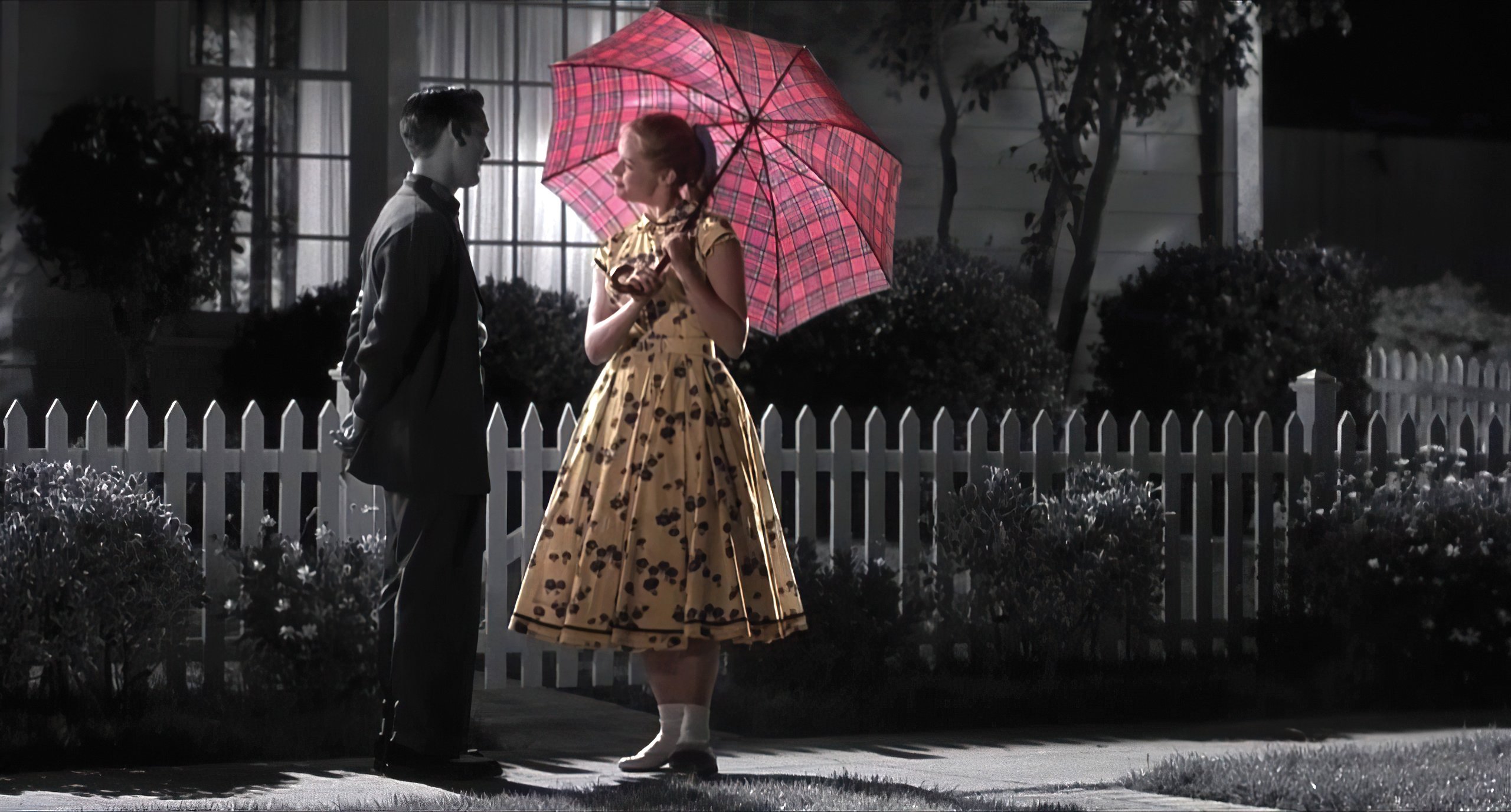
From the golden haze of neo-noir to the frigid detachment of dystopian science fiction, color temperature is more than aesthetic. It’s emotional manipulation. Different genres come preloaded with audience expectations—suspense in thrillers, sentimentality in romance, paranoia in horror—and the use of temperature-driven lighting taps directly into those expectations. The technique isn’t about realism but interpretation, guiding how we feel about characters and the spaces they inhabit.
Crimes in the Heat: Warm Tones in Crime and Thriller Films
Nowhere is this technique more pronounced than in crime films. The “sunset crime” look—a blend of deep amber and rust hues—has become a visual shorthand for danger cloaked in beauty, lawlessness at twilight. Films like Heat, Traffic, or Sicario embrace this approach, casting their morally ambiguous tales in an oppressive desert warmth. Cinematographers utilize golden-hour lighting and sodium vapor-inspired color grading to create an aesthetic where the environment itself feels volatile. That warmth isn’t comforting; it’s suffocating. It creates an illusion of softness while the narrative underneath brims with betrayal and violence.
Case Study: Sicario and the Heat of Moral Decay
Take Sicario, for example. Roger Deakins’ cinematography washes the frame in blistering heat. The desert isn’t just a setting; it’s a character. The warm palette is relentless, burning through the screen, symbolizing a justice system too hot to touch, where truth dissolves into mirage. In this way, the warm color temperature isn’t just stylistic—it heightens tension by emphasizing the psychological discomfort of a world too chaotic to navigate with moral clarity. That heat tells us the stakes are high and compromise is inevitable.
Chilling Revelations: Cool Tones in Psychological Drama
Contrast that with the “icy confession” aesthetic of psychological thrillers and dramas, where cool tones dominate. Here, filmmakers turn to color temperature to evoke isolation, emotional numbness, and suppressed truths. Think of David Fincher’s Zodiac or The Girl with the Dragon Tattoo, both shot in frigid blue-greys that mirror the inner desolation of the characters. The visual coldness creates distance, reflecting characters who are emotionally repressed or environments governed by rigid structures.
David Fincher’s Cold Precision
In Fincher’s work, color temperature becomes a psychological cage. In Zodiac, the investigation stretches over years, lives crumble, obsessions bloom—and yet the palette stays restrained and wintry. The audience, much like the characters, is locked in an endless fog of ambiguity. That choice wasn’t incidental. Fincher and his team meticulously crafted the film’s digital color grade to maintain that frost, using desaturated tones and carefully calibrated lighting to extinguish warmth. The result? A cinematic experience that feels cold to the touch and harder to escape.
Science Fiction and the Sterile Future
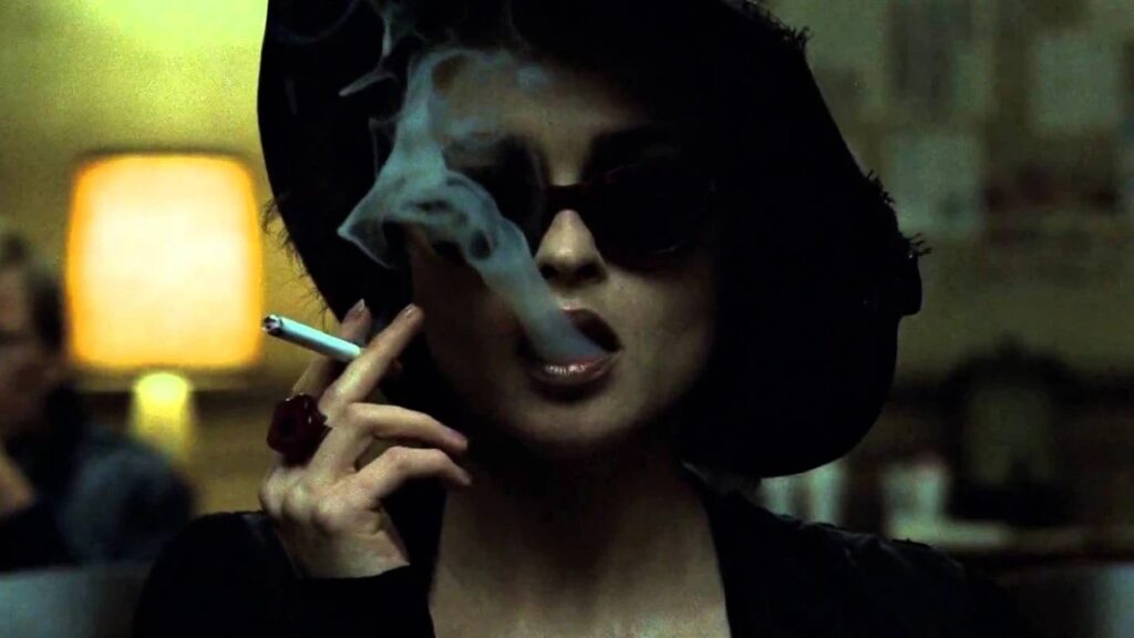
Science fiction as a genre leans heavily on the cool end of the color spectrum. Films like Blade Runner 2049, Ex Machina, and Minority Report deploy blue and cyan temperatures not only to suggest futuristic settings but to mirror the alienation inherent in these worlds. The coolness is more than a nod to neon lights or sleek technology—it reflects humanity’s growing detachment from nature, ethics, and often, itself. A world bathed in perpetual blue becomes a metaphor for sterile perfection or emotional voids. This sense of cold detachment contrasts sharply with the grounded precision of concrete cleaning St. Augustine, where tangible results restore clarity and connection to the real world.
Blade Runner 2049: When Cold Meets Collapse
Blade Runner 2049, lensed by Roger Deakins, once again demonstrates the fusion of genre and color temperature to world-building effect. The film moves between the extremes—clinical cyan interiors and radioactive orange wastelands. These sharp contrasts aren’t merely decorative; they convey dissonance. In scenes drenched in blue, characters appear consumed by artificiality, trapped in systems beyond their control. In the orange-tinted Las Vegas sequence, the warmth doesn’t offer relief—it signals decay and ruin. Deakins turns temperature into time, heat into entropy, and the result is a visual grammar uniquely suited to the film’s dystopian narrative.
The Romantic Warmth and Horror Chill
Even romantic dramas and horror films manipulate color temperature to enhance genre beats. Romantic films often opt for warm, golden hues to elicit intimacy, nostalgia, and safety. But when those tones shift—becoming colder in scenes of heartbreak or loss—the audience feels it intuitively. The warmth has gone, and with it, emotional equilibrium. In horror, filmmakers reverse that equation. They may begin with neutral or slightly warm lighting only to plunge the viewer into bluish dread as events turn sinister. Ari Aster’s Hereditary and Midsommar demonstrate this in subtle but effective ways, using tonal shifts to mark transitions between psychological states. This deliberate use of visual tone reflects the precision of CPG branding, where every detail shapes emotional response and consumer connection.
Blurring the Lines: Drive and Genre Fluidity
A fascinating genre hybrid like Drive, directed by Nicolas Winding Refn, showcases how color temperature can blur genre boundaries. The film toggles between action thriller, romance, and existential drama, and its lighting strategy reflects that flux. The cityscapes glow in warm neon pinks and oranges—romantic, nostalgic, but also dangerous. Inside apartments or hospital rooms, the light cools, often becoming washed out or pale, underlining the Driver’s emotional sterility. It’s a visual seesaw between hope and emptiness. These shifts are seldom explained but deeply felt.
Behind the Scenes: Tools for Temperature Control
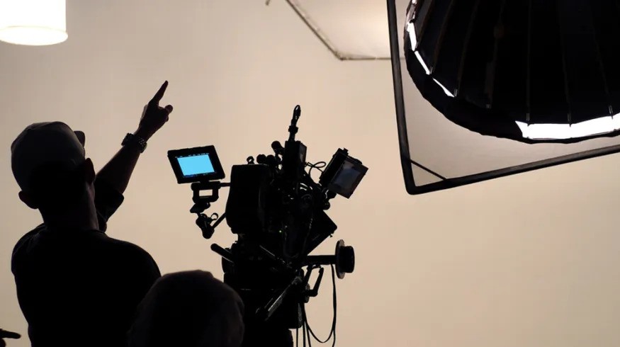
Understanding how filmmakers achieve these temperature effects reveals the technique’s complexity. Cinematographers begin with lighting choices: tungsten bulbs (approx. 3200K) yield warm tones, while daylight-balanced bulbs (around 5600K) cast cooler light. Fluorescents and LEDs allow even finer control, while filters and gels—such as CTO (color temperature orange) or CTB (color temperature blue)—modify the native light to create desired effects. Once filming is complete, color grading in post-production fine-tunes the palette, often using software like DaVinci Resolve to push specific temperatures to emotional extremes.
Motivation Over Manipulation
But this manipulation must serve the story. Poorly motivated color temperature choices risk breaking immersion or coming off as pretentious. The reason films like No Country for Old Men or The Assassination of Jesse James by the Coward Robert Ford feel so emotionally coherent is because their temperature palettes align with their narrative truths. These are stories of decay, isolation, and myth, and their amber-gold twilight visuals ground the viewer in that poetic desolation. It’s the opposite of escapism—it’s confrontation through beauty.
Temperature as Visual Subtext
When used with intention, color temperature becomes a stealthy yet indispensable storytelling tool. It can foreshadow, reflect, and even lie. A room bathed in warm light might hide sinister truths. A sterile blue corridor could be the path to freedom. Because humans associate color temperature with lived experiences—sunsets with calm, blue hues with night—we are neurologically primed to interpret these cues without conscious effort. That’s what makes the technique so powerful in genre filmmaking. It works invisibly, shaping reactions before we’ve had time to rationalize them.
The Evolving Future of a Timeless Tool
Genre storytelling thrives on sensory immersion. Whether it’s the suspense of a noir thriller, the melancholy of a tragic romance, or the dread of a psychological horror, filmmakers strive to create worlds where tone is consistent, mood is palpable, and the audience is never let off the hook emotionally. Color temperature, when used well, becomes the unseen architect of that experience. It bathes the world in heat or drains it of comfort, not for visual flair, but for narrative purpose.
In today’s digital era, the possibilities for controlling color temperature are virtually limitless, and filmmakers are exploiting that freedom with increasing sophistication. But at its core, the technique still draws from primal associations—fire and ice, dusk and dawn, warmth and chill. These are contrasts we’ve known since the beginning of human storytelling, and cinema, ever the modern mythmaker, uses them to turn light into meaning.
